Lyle's Golden Syrup undergoes first rebrand since 1883 as bible-inspired lion logo updated


Lyle's Golden Syrup has undergone a huge rebrand - the first makeover for the company since 1883.
The lion logo, which features a dead lion surrounded by bees, has featured on products since Victorian times, with the Lyle's holding the Guinness World Record for the world’s oldest unchanged brand packaging. It was placed on the product at the request of founder Abram Lyle, who wanted the Christian analogy featured.
Advertisement
Hide AdAdvertisement
Hide AdThe Book of Judges details Samson killing a lion with his bare hands before returning to the carcass a few days later to find a swarm of bees had created a hive in its body. He then collected the honey from the hive and fed it to his parents - not telling them where the honey came from.
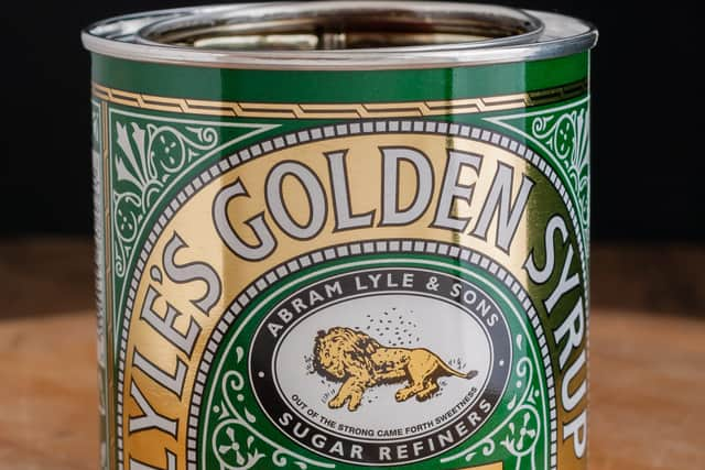
The story also features the famous riddle “out of the eater, something to eat; out of the strong, something sweet", which Samson posed to guests at his wedding. A version of the riddle was put onto the Lyle's Golden Syrup tins, with the products displaying “out of the strong came forth sweetness” underneath the lion illustration.
The new logo, which will feature on squeezy bottles of syrup, instead shows a stylised and modern lion, with one bee next to its head in a nod to the original illustration. The logo will not appear on tins of syrup, which will continue to carry the original design. James Whiteley, brand director for Lyle’s Golden Syrup, said: “We’re excited to unveil a fresh redesign for the Lyle’s Golden Syrup brand. While we’ll continue to honour our original branding with the heritage tin, consumers need to see brands moving with the times and meeting their current needs.
“Our fresh, contemporary design brings Lyle’s into the modern day, appealing to the everyday British household while still feeling nostalgic and authentically Lyle’s. We’re confident that the fresh new design will make it easier for consumers to discover Lyle’s as an affordable, everyday treat, while re-establishing the brand as the go-to syrup brand for the modern UK family, featuring the same delicious taste that makes you feel Absolutely Golden."
Comment Guidelines
National World encourages reader discussion on our stories. User feedback, insights and back-and-forth exchanges add a rich layer of context to reporting. Please review our Community Guidelines before commenting.