WH Smith's rebrand to 'WHS' is heavily criticised - here are some more of the worst brand changes we remember


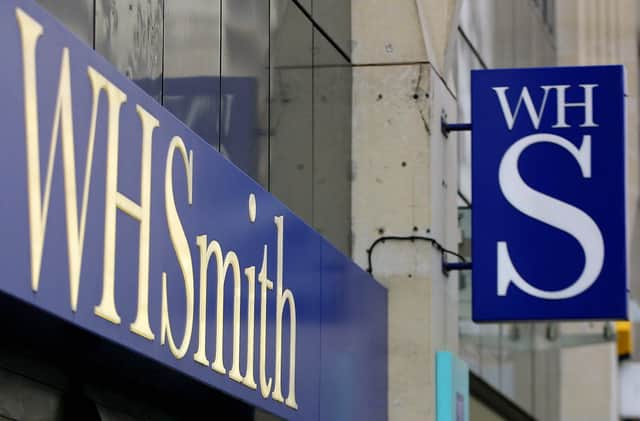
A new rebrand attempt for Wh Smith's stores doesn't seem to have gone down as well as expected. The trial which has seen new signage placed on UK storefronts has prompted criticism as many say it looks too similar to the NHS logo.
Ten shops in England have adopted the new signs - including stores in Preston and York. The signage there reads 'WHS' instead of the retailer's full name. WH Smith has around 1,100 stores in the UK and it remains unclear if the new signage will be extended to all stores.
Advertisement
Hide AdAdvertisement
Hide AdIt has definitely drawn comments and criticism from members of the public online, however. One X user immediately saw the resemblance to the NHS logo.
An X user commented: "Very few have shortened WHSmith to WHS, so the rebrand doesn’t resonate. It also looks ugly and is too similar to the NHS logo. Waste of time and money!"
Another X user tweeted to say: "What is so annoying is that it takes just as long to say "WHS" out loud as "WHSmith". "And so everyone usually calls it "Smith's for short. Which is the bit they've taken out of the branding. Terrible decision (Before you even get to the fact that it looks too much like NHS!)"
The criticism got us wondering about other famous rebrands that failed to make a mark.
Twitter/X
Advertisement
Hide AdAdvertisement
Hide AdIn July 2023, many of us were confused to see announcements that Twitter would now be called 'X'. The time of the app's recognised bird logo had also come to an end. Marketing professor Jean-Pierre Dube told the BBC he thought it was a joke, asking why anyone would "throw away" such a recognised brand as Twitter's.
Royal Mail
This was quickly abandoned and therefore quickly forgotten for many people. In 2001, Royal Mail decided to change its name to Consignia as part of a £1.5 million rebrand. But after only a year, it was clear that the new name wasn't catching on and Royal Mail was soon back - reportedly costing the company another £1 million.
Gap
American clothing company Gap changed its logo in 2010 causing much social media backlash. In fact, on this occasion, the backlash was so intense that the company reverted its logo after only one week.
Leeds United
This one was simply unforgettable and was undoubtedly a PR nightmare. Yorkshire-based football club Leeds United decided to change its logo in 2018 - with disastrous consequences.
Advertisement
Hide AdAdvertisement
Hide AdIt's fair to say Leeds fans were having none of it. 77,000 pf them signed a petition to boycott the rebrand - and thankfully for them, the club listened.
Mark Zuckerberg’s Facebook changed its name to Meta in October 2021. It was part of an attempt to signal its future as a “metaverse company”.
Zuckerberg insisted the rebrand had nothing to do with the company's 2021 PR crisis which centred around claims the US Capitol riots were organised on the social media platform and employee-turned-whistleblower Frances Haugen’s allegations.
And the new name didn’t help change opinions. According to a report from The Harris Poll, public trust in Zuckerberg’s company dropped heavily after the announcement that it was going to be known as 'Meta'.
Comment Guidelines
National World encourages reader discussion on our stories. User feedback, insights and back-and-forth exchanges add a rich layer of context to reporting. Please review our Community Guidelines before commenting.
